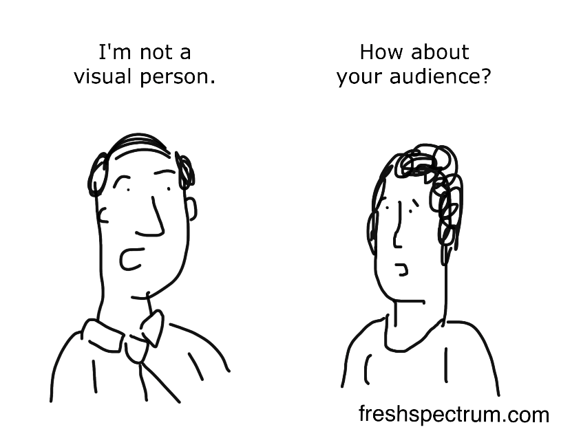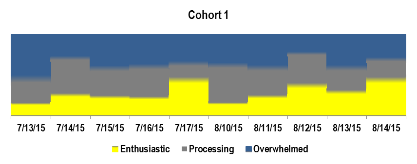

It’s all too easy for our evaluation reports to become a lifeless pile of numbers that gather dust on a shelf. As evaluators and PIs, we want to tell our stories and we want those stories to be heard. Data visualizations (like graphs and infographics) can be powerful ways to share evaluation findings, quickly communicate key themes, and ultimately have more impact.
Communicating evaluation findings visually can also help your stakeholders became better data analysts themselves. I’ve found that when stakeholders see a graph showing survey results, they are much more likely to spend time examining the findings, asking questions, and thinking about what the results might mean for the project than if the same information is presented in a traditional table of numbers.
Here are a few tips to get you started with data visualization:
- Start with the data story. Pick one key finding that you want to communicate to a specific group of stakeholders. What is the key message you want those stakeholders to walk away with?
- Put the mouse down! When you’re ready to develop a data viz, start by sketching various ways of showing the story you want to tell on a piece of paper.
- Use Stephanie Evergreen’s and Ann Emery’s checklist to help you plan and critique your data visualization: https://stephanieevergreen.com/data-visualization-checklist.
- Once you’ve drafted your data viz, run it by one or two colleagues to get their feedback.
Some PIs, funders, and other stakeholders still want to see tables with all the numbers. We typically include tables with the complete survey results in an appendix.
Some of my favorite data viz resources:
- Stephanie Evergreen has written a number of blogs with step-by-step instructions showing you how to create various charts in Excel: http://stephanieevergreen.com/tag/step-by-step/
- Ann Emery’s website has a section with step-by-step videos showing how to produce charts in Excel: http://annkemery.com/excel/charts/
- Cole Nussbaumer also has a great blog that includes several examples of how to redesign charts to make them more effective: http://www.storytellingwithdata.com/
For more design inspiration, check out:
Finally, don’t expect to hit a home run your first time at bat. (I certainly didn’t!) You will get better as you become more familiar with the software you use to produce your data visualizations and as you solicit and receive feedback from your audience. Keep showing those stories!


Except where noted, all content on this website is licensed under a Creative Commons Attribution-NonCommercial-ShareAlike 4.0 International License.


 EvaluATE is supported by the National Science Foundation under grant number 2332143. Any opinions, findings, and conclusions or recommendations expressed on this site are those of the authors and do not necessarily reflect the views of the National Science Foundation.