

Using color for brand recognition is an easy way to pull project branding into charts or reports.
Why do you want to do that? Well, the human brain recognizes colors even without the logo is present. For instance, what do you think of when you see this color green?

Those of you who are coffee drinkers probably recognize it. Once we add in the full logo, you see it’s the Starbucks Coffee logo.

Green is their primary color; they use it throughout their stores and website. You can use this same trick with your projects. When you use color consistently, your audience will start recognizing your brand.
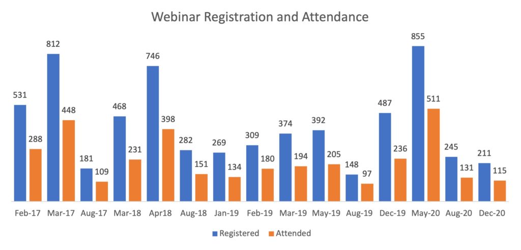
Let’s turn to an example from EvaluATE. Below is a column chart displaying webinar registration and attendee data for 2017 through 2020. The first chart is in default Microsoft Office colors. The chart is easy to read, but the color is not intentionally branded to the project.
Let’s give this a quick update to reflect EvaluATE’s branding colors. Here are our project colors from our style guide.
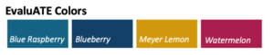
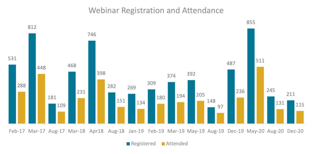 By changing the chart to EvaluATE’s colors (Blue Raspberry and Meyer Lemon) we’ve branded the chart to identify with EvaluATE.
Let’s broaden our example to a one-page resource. This resource was created by our team to share tips on using slack. This first example has been altered to use the Microsoft Office default colors.

The document is easy to read and uses colors well. But if someone were to pick this up, they may not realize it was an EvaluATE product unless they spotted the logo. Let’s take this same document and apply EvaluATE’s branding colors.

In this second version, you can see that we are now using EvaluATE’s colors.
Color can make a big impact on your audiences’ memory and perception of your project. It only takes a few minutes to update colors, so I would encourage you to do so for your projects!
If you are interested in learning more, you can check out a few resources on color:
- Coolors is a great color-picker site that helps you identify a palette. Check it out if you don’t have a color palette for your project yet.
- Viz Palette shows what different color palettes look like in different types of graphs. It also lets you know if the shades you’ve chosen will be an issue for those with color blindness. It even points out if the color names may confuse team members working with your colors.
This guide from Canva explores what colors mean, how companies use them, and how to choose and use colors intentionally in your branding and visualizations.
Have additional questions? Connect with me: emma.leeburg@wmich.edu or on the Evaluation Slack Community!

Emma Binder
Marketing and Communication Specialist Senior, The Evaluation Center, Western Michigan UniversityEmma Binder was a Marketing and Communication Specialist Senior at The Evaluation Center at Western Michigan University and was the co-principal investigator for EvaluATE, the evaluation hub for the National Science Foundation’s Advanced Technological Education (ATE) program.

Except where noted, all content on this website is licensed under a Creative Commons Attribution-NonCommercial-ShareAlike 4.0 International License.